1. Before It Had a Name of Its Own
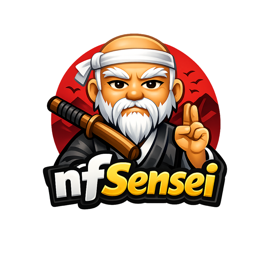
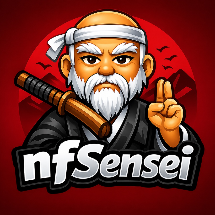
The oldest surviving logo file in the project is literally named nfSense_original — from back when the working name still leaned on pfSense's shadow rather than standing apart from it. The character in it, though, is already fully realized: a bald elder with a long white beard, a white headband, a wooden-handled katana slung across one shoulder, throwing a two-finger peace sign, set in front of a red sun and mountain silhouette, with nfSensei already lettered underneath in white and gold.
A second file from the same batch, tellingly named nfSensei-new, applies a heavy sepia grain and vignette to the exact same composition — a rougher, more weathered treatment testing whether a "worn-in" print texture read better than clean vector art.
2. Testing the Palette
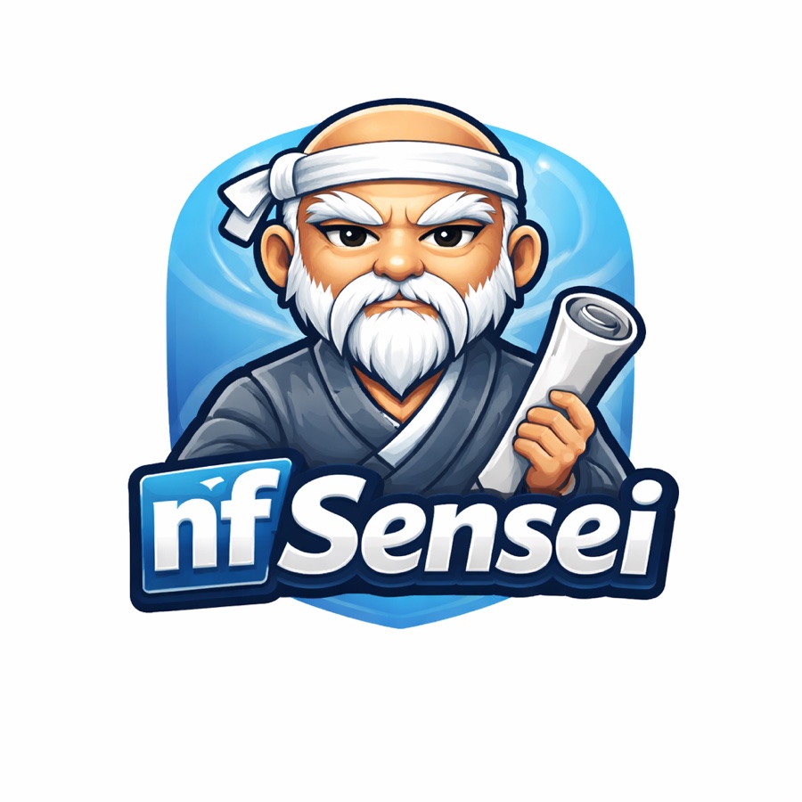
Two more early files swapped pieces out one at a time instead of reworking the whole scene. blue variant keeps the same bald, white-bearded character but trades the katana for a rolled scroll, drops the red sun entirely, and sits him inside a cool blue rounded-square badge next to a small blue "nf" tile — a calmer, more software-y read than the sword-and-sun original.
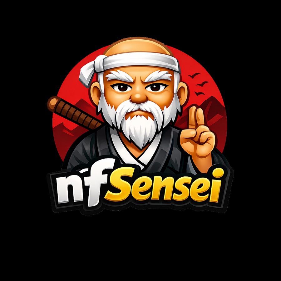
logo_behind strips the scene down further: it's a plain cutout of the sword-and-peace-sign character with the red-sun background removed entirely, presumably prepared so the mascot could sit on top of whatever background a given page already had, rather than being locked to its own.
3. The Name Locks In — and Ships
Between the scroll-and-blue-badge alternative and the sword-and-sun original, the original won. This file was committed to the repository on July 8, 2026, and — full disclosure — it is what nfSensei actually ships today: it's the image in the sidebar, the login screen, and the app header of every build currently running.
Layout.tsx, Sidebar.tsx, and Login.tsx. Nothing below has replaced it — yet.4. Then: About 300 Ideas in a Week
Sometime after the sword-and-sun mark had already shipped, the project cast a much wider net anyway. A single design pass produced 297 numbered concept files, ranging from abstract network-topology art to at least two entirely different mascot characters that share nothing with the bearded elder above.

5. Narrowing to a Shortlist of Eight
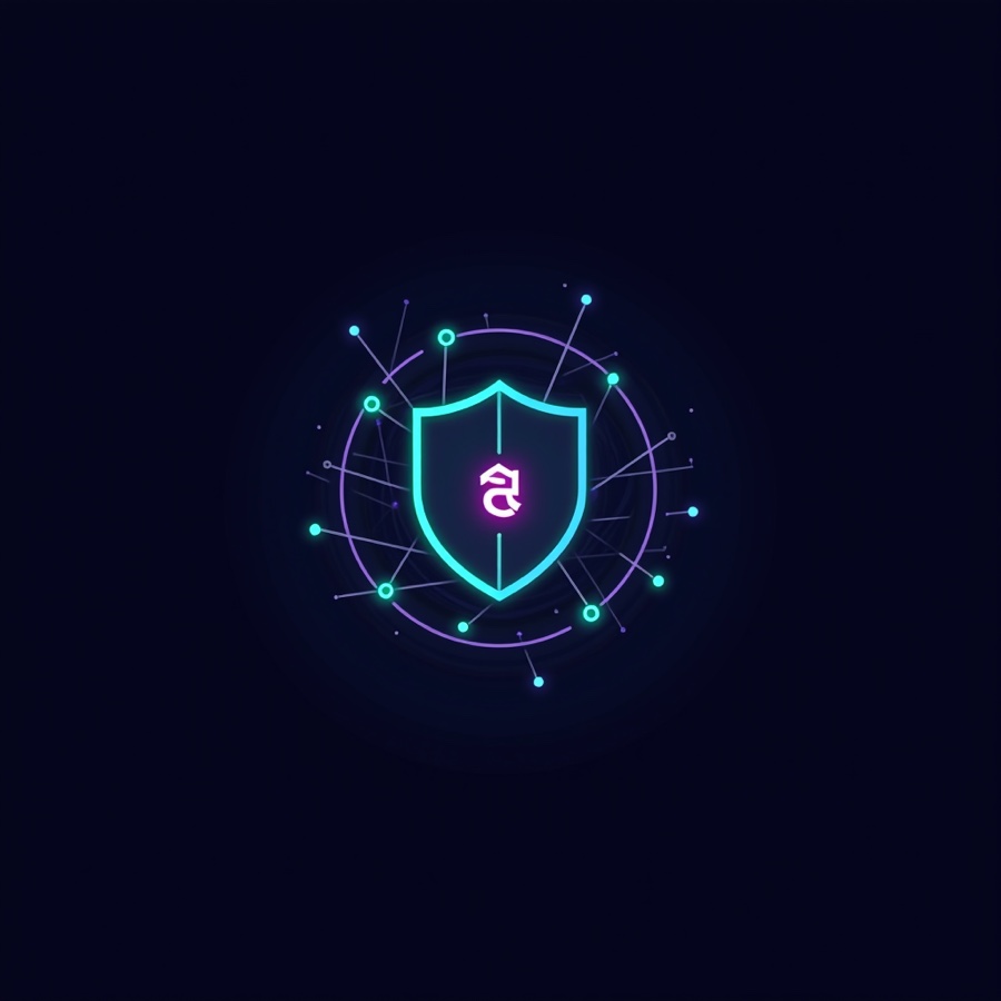
Out of that batch, eight concepts got pulled aside and given real names instead of numbers — the closest thing to an official shortlist in the whole archive.





6. Converging on a Face
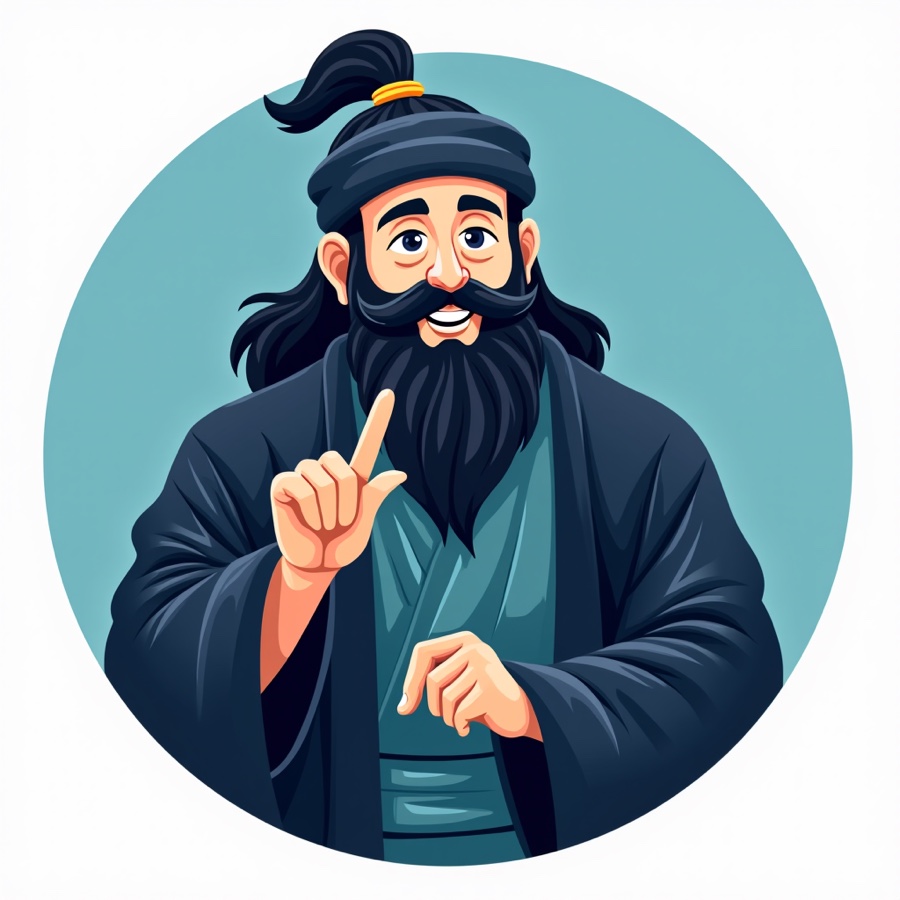
None of the eight above ended up carrying the brand forward. Instead, three further rounds went back to the original bearded-elder character and ran him through a deliberate narrowing process.
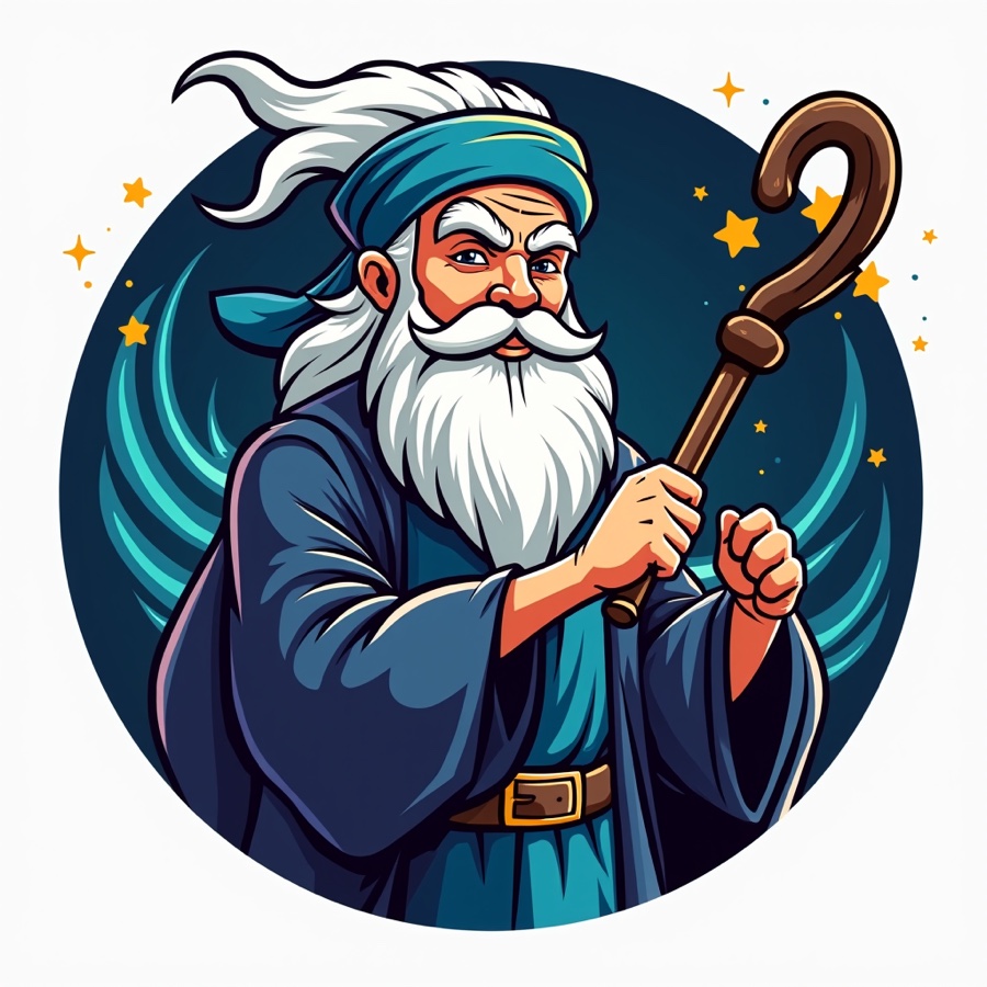
The first round kept a full illustrated body and tried it across a wide range of moods: serene prayer with closed eyes, a jovial gold-tooth grin mid-lesson, and — shown below — a dynamic action pose with a hooked staff and windswept hair.
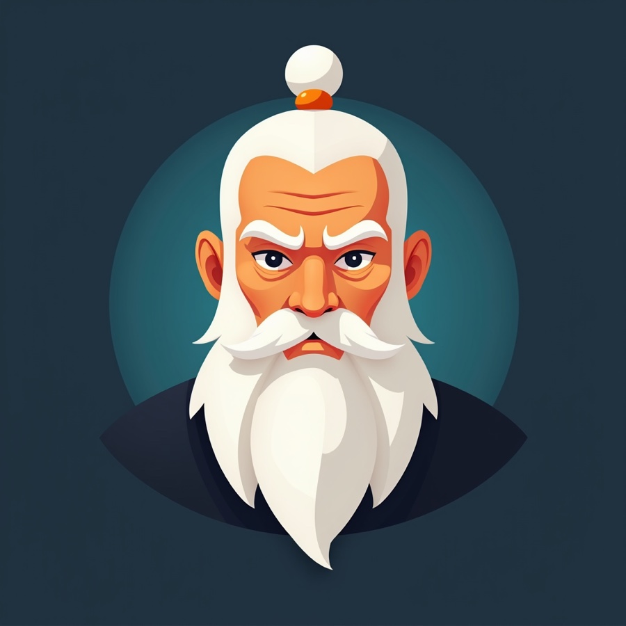
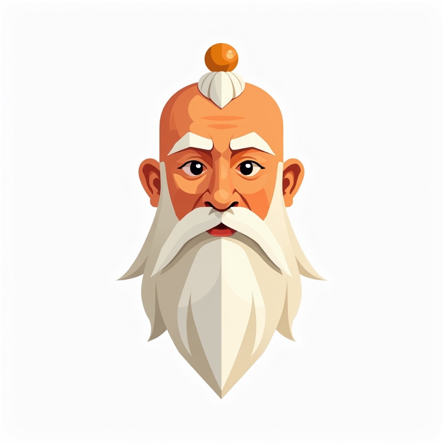
The next round dropped the body entirely and distilled the character down to a face-only icon: a bald head, a small topknot, sharp angular eyebrows, and a long pointed beard. That single face was then pressure-tested across every format a mark needs — standalone icon, circular badge, wordmark lockup, heraldic shield, even a four-background color-swatch sheet.
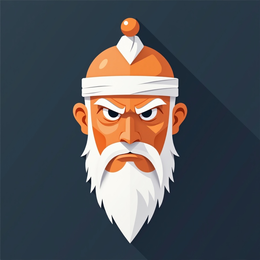
The last round treated that face as fixed and ran a controlled matrix on top of it: a fully wrapped cloth headband against a bare topknot, and an "angry," deep-furrowed brow against a "calm, wise" brow with added cheek color — each combination tested on both dark and white backgrounds.
7. Today: Two Directions, Still Open
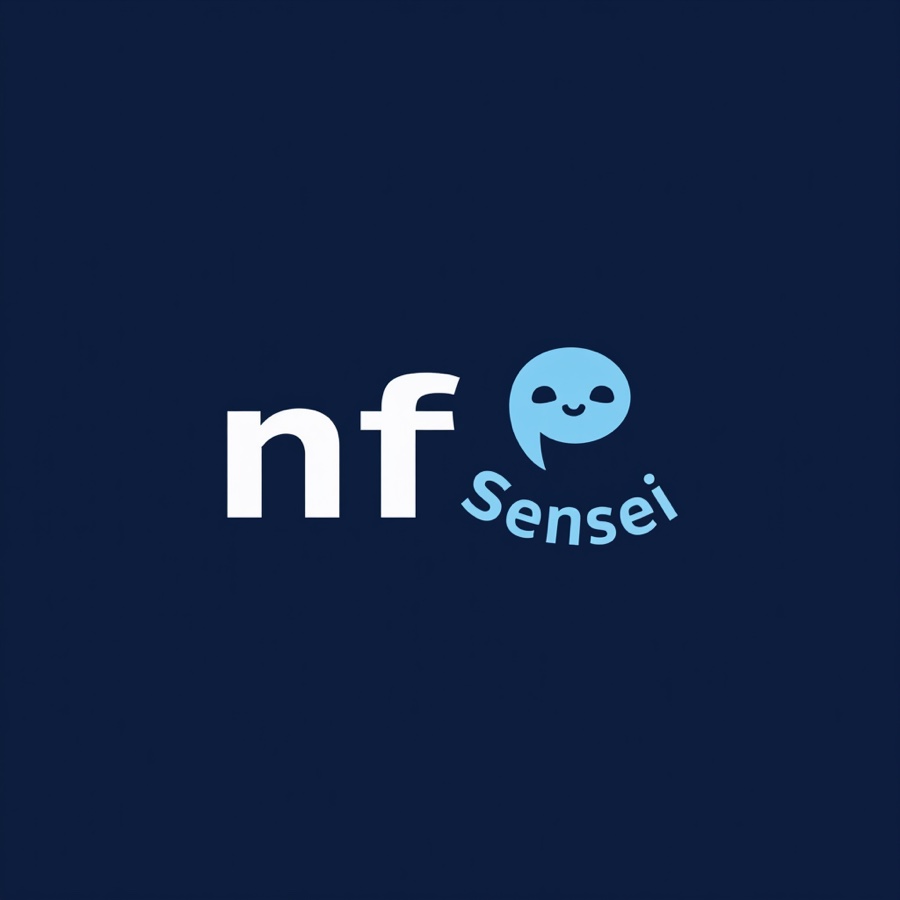
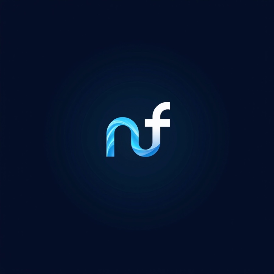
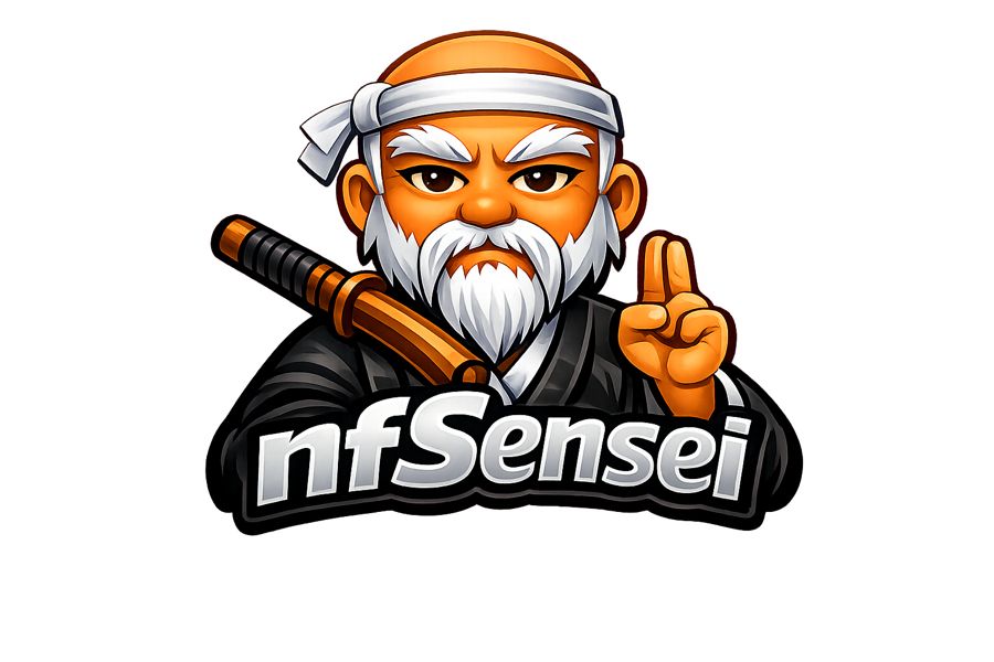
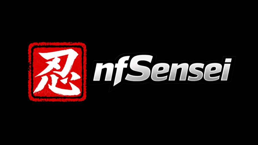
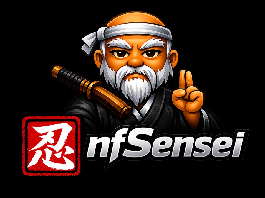
As of today, that expression-and-headwear fork hasn't settled into one winner — it's forked again, into two different bets on what the front-facing mark should even be. Neither has been chosen over the other. These are the four files actually sitting on the table right now, in the order they were made today.
8. Where This Leaves Things
The sword, the sun, and the peace sign showed up in the very first file and outlasted a roughly 300-concept search that tried abstract shields, network diagrams, and at least two unrelated mascots. What's actually open right now isn't whether the bearded elder survives — it's whether he ships alone, ships next to a completely different kanji-and-chrome wordmark, or ships as the combined lockup that already tries to do both. The logo in the sidebar today hasn't changed. This post will get an update when one of the four candidates above does.